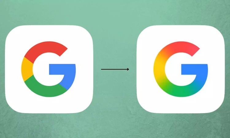
Google has begun rolling out a refreshed version of its iconic “G” logo across platforms, marking the company’s first significant brand update since 2015. The brighter, four-color gradient design — already visible on Google Search — will now extend companywide.
A Modern Twist on a Familiar Icon
The redesigned “G” preserves Google’s signature blue, red, yellow, and green palette but introduces a more vibrant gradient and sleeker contours. The company’s design teams describe the change as an evolution rather than a reinvention, ensuring the logo remains instantly recognizable while optimized for clarity across diverse devices and screen sizes.
From 2015 to the AI-First Era
The last major redesign came in 2015, when Google reworked its logotype and icon family to reflect its expansion beyond desktop search. The 2025 refresh arrives as Google emphasizes its AI-first strategy, highlighted by innovations such as Gemini AI and its integration into Workspace, Search, and Android.
Symbol of a Forward-Looking Brand
Industry analysts note that even subtle design changes carry global significance, as the Google logo is displayed billions of times daily across apps, services, and hardware. Company representatives stressed that the refresh is more than cosmetic, representing Google’s mission to remain dynamic, adaptable, and future-focused in a rapidly changing tech landscape.
Gradual Rollout Across Products
The new logo will appear progressively across Google’s apps, hardware, and digital services in the coming weeks, ensuring a consistent visual identity as the company continues to expand its AI ecosystem.

